Do you want BuboFlash to help you learning these things? Or do you want to add or correct something? Click here to log in or create user.
#has-images #quantitative-methods-basic-concepts #statistics
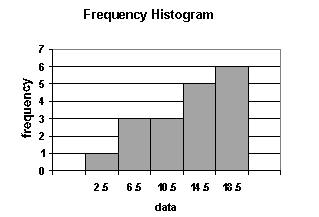
1. A histogram is a bar chart that displays a frequency distribution. It is constructed as follows:

- The class frequencies are shown on the vertical (y) axis (by the heights of bars drawn next to each other).
- The classes (intervals) are shown on the horizontal (x) axis.
- There is no space between the bars.

From a histogram, we can see quickly where most of the observations lie. The shapes of histograms will vary, depending on the choice of the size of the intervals.
If you want to change selection, open document below and click on "Move attachment"
Subject 3. Frequency Distribution
signment. These values can be measured using sufficiently accurate tools to numerous decimal places. There are two methods that graphically represent continuous data: histograms and frequency polygons. <span>1. A histogram is a bar chart that displays a frequency distribution. It is constructed as follows: The class frequencies are shown on the vertical (y) axis (by the heights of bars drawn next to each other). The classes (intervals) are shown on the horizontal (x) axis. There is no space between the bars. From a histogram, we can see quickly where most of the observations lie. The shapes of histograms will vary, depending on the choice of the size of the intervals. 2. The frequency polygon is another means of graphically displaying data. It is similar to a histogram but the bars are replaced by a line joined together. It is constructed in the follo
Summary
| status | not read | reprioritisations | ||
|---|---|---|---|---|
| last reprioritisation on | suggested re-reading day | |||
| started reading on | finished reading on |
Details
Discussion
Do you want to join discussion? Click here to log in or create user.