Do you want BuboFlash to help you learning these things? Or do you want to add or correct something? Click here to log in or create user.
#cfa-level-1 #economics #has-images #microeconomics #reading-15-demand-and-supply-analysis-the-firm #section-3-analysis-of-revenue-costs-and-profit #study-session-4
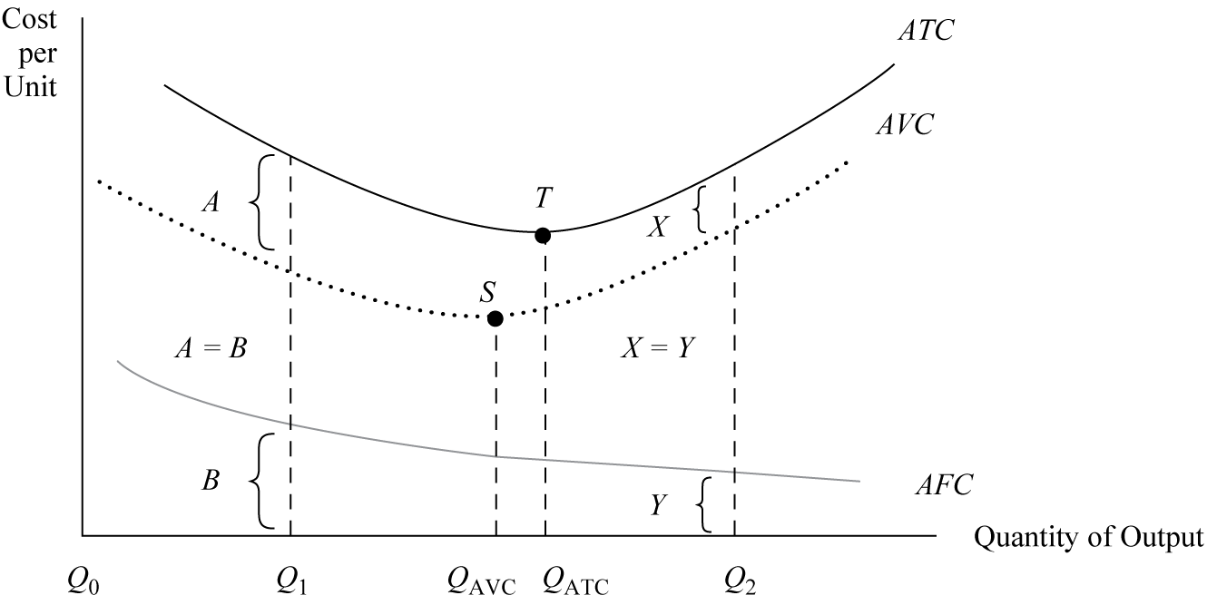
This shows the cost curve relationships among ATC, AVC, and AFC in the short run.
The difference between ATC and AVC at any output quantity is exactly equal to the amount of AFC.
Both ATC and AVC take on a bowl-shaped pattern in which each curve initially declines, reaches a minimum-cost output level, and then increases.
Point S, which corresponds to QAVC, is the minimum point on the AVC .
Point T, which corresponds to QATC, is the minimum point on ATC.
When output increases, average fixed cost declines as AFC approaches the horizontal quantity axis.
If you want to change selection, open original toplevel document below and click on "Move attachment"
Summary
| status | not read | reprioritisations | ||
|---|---|---|---|---|
| last reprioritisation on | suggested re-reading day | |||
| started reading on | finished reading on |
Details
Discussion
Do you want to join discussion? Click here to log in or create user.