Edited, memorised or added to reading queue

on 29-Mar-2016 (Tue)

Do you want BuboFlash to help you learning these things? Click here to log in or create user.

Bond Equivalent Yield
#has-images #quantitative-methods-basic-concepts

Periodic bond yields for both straight and zero-coupon bonds are conventionally computed based on semi-annual periods, as U.S. bonds typically make two coupon payments per year. For example, a zero-coupon bond with a maturity of five years will mature in 10 6-month periods. The periodic yield for that bond, r, is indicated by the equation Price = Maturity value x (1 + r)-10. This yield is an internal rate of return with semi-annual compounding. How do we annualize it?

The convention is to double it and call the result the bond's yield to maturity. This method ignores the effect of compounding semi-annual YTM, and the YTM calculated in this way is called a bond-equivalent yield (BEY).

However, yields of a semi-annual-pay and an annual-pay bond cannot be compared directly without conversion. This conversion can be done in one of the two ways:

  • Convert the bond-equivalent yield of a semi-annual-pay bond to an annual-pay bond.

  • Convert the equivalent annual yield of an annual-pay bond to a bond-equivalent yield.

Example

  • A Eurobond pays coupon annually. It has an annual-pay YTM of 8%.
  • A U.S. corporate bond pays coupon semi-annually. It has a bond equivalent YTM of 7.8%.
  • Which bond is more attractive, if all other factors are equal?

Solution 1

  • Convert the U.S. corporate bond's bond equivalent yield to an annual-pay yield:
  • Annual-pay yield = [1 + 0.078/2]2 - 1 = 7.95% < 8%
  • The Eurobond is more attractive since it offers a higher annual-pay yield.

Solution 2

  • Convert the Eurobond's annual-pay yield to a bond equivalent yield (BEY):
  • BEY = 2 x [(1 + 0.08)0.5 - 1] = 7.85% > 7.8%
  • The Eurobond is more attractive since it offers a higher bond equivalent yield.
statusnot read reprioritisations
last reprioritisation on suggested re-reading day
started reading on finished reading on


Subject 2. Measurement Scales
#analyst-notes #quantitative-methods-basic-concepts #statistics
Measurement is the assignment of numbers to objects or events in a systematic fashion. To choose the appropriate statistical methods for summarizing and analyzing data, we need to distinguish between different measurement scales or levels of measurement.

  • Nominal Scale

    • Nominal measurement represents the weakest level of measurement.
    • It consists of assigning items to groups or categories.
    • No quantitative information is conveyed and no ordering (ranking) of the items is implied.
    • Nominal scales are qualitative rather than quantitative.

    Religious preference, race, and sex are all examples of nominal scales. Another example is portfolio managers categorized as value or growth style will have a scale of 1 for value and 2 for growth. Frequency distributions are usually used to analyze data measured on a nominal scale. The main statistic computed is the mode. Variables measured on a nominal scale are often referred to as categorical or qualitative variables.

  • Ordinal Scale

    • Measurements on an ordinal scale are categorized.
    • The various measurements are then ranked in their categories.
    • Measurements with ordinal scales are ordered with higher numbers representing higher values. The intervals between the numbers are not necessarily equal.

    Example 1

    On a 5-point rating scale measuring attitudes toward gun control, the difference between a rating of 2 and a rating of 3 may not represent the same difference as that between a rating of 4 and a rating of 5.

    Example 2

    Two categories might be value and growth. Within each category, the portfolio managers measured will be weighted according to performance on a scale from 1 to 10, with 1 being the best- and 10 the worst-performing manager.

    There is no "true" zero point for ordinal scales, since the zero point is chosen arbitrarily. The lowest point on the rating scale in the example was arbitrarily chosen to be 1. It could just as well have been 0 or -5.

  • Interval Scale

    Interval scales rank measurements and ensure that the intervals between the rankings are equal. Scale values can be added and subtracted from each other.

    For example, if anxiety was measured on an interval scale, a difference between a score of 10 and a score of 11 would represent the same difference in anxiety as the difference between a score of 50 and a score of 51.

    Interval scales do not have a "true" zero point. Therefore, it is not possible to make statements about how many times higher one score is than another. For the anxiety example, it would not be valid to say that a person with a score of 30 was twice as anxious as a person with a score of 15. True interval measurement is somewhere between rare and nonexistent in the behavioral sciences. No interval scales measuring anxiety, such as the one described in the example, actually exist. A good example of an interval scale is the Fahrenheit measure of temperature. Equal differences on this scale represent equal differences in temperature, but a temperature of 30°F is not twice as warm as one of 15°F.

  • Ratio Scale

    Ratio scales are like interval scales except that they have true zero points. This is the strongest measurement scale. In addition to permitting ranking and addition or subtraction, ratio scales allow computation of meaningful ratios. A good example is the Kelvin scale of temperature. This scale has an absolute zero. Thus, a temperature of 300°K is twice as high as a temperature of 150°K. Two financial examples of ratio scales are rates of return and money. Both examples can be measured on a zero scale, where zero represents no return, or in the case of money, no money.

Note that as you move down t...
statusnot read reprioritisations
last reprioritisation on suggested re-reading day
started reading on finished reading on


Subject 3. Frequency Distribution
#has-images #quantitative-methods-basic-concepts #statistics
Very often, the data available is vast, leading to a situation where dealing with individual numbers becomes laborious and messy. In such circumstances, it is neater and more convenient to summarize results into what is known as a frequency table. The data in the display is called a frequency distribution.

An interval, also called a class, is a set of values within which an observation falls.

  • Each interval has a lower limit and an upper limit.
  • Intervals must be all-inclusive and non-overlapping.

A frequency distribution is a tabular display of data categorized into a small number of non-overlapping intervals. Note that:

  • Each observation can only lie in one interval.
  • The total number of intervals will incorporate the whole population.
  • The range for an interval is unique. This means a value (observation) can only fall into one interval.

It is important to consider the number of intervals to be used. If too few intervals are used, too much data may be summarized and we may lose important characteristics; if too many intervals are used, we may not summarize enough.

A frequency distribution is constructed by dividing the scores into intervals and counting the number of scores in each interval. The actual number of scores and the percentage of scores in each interval are displayed. This helps in the analysis of large amount of statistical data, and works with all types of measurement scales.

  • Absolute frequency is the actual number of observations in a given interval.

  • Relative frequency is the result of dividing the absolute frequency of each return interval by the total number of observations.

  • Cumulative absolute frequency and cumulative relative frequency are the results from cumulating the absolute and relative frequencies as we move from the first to the last interval.

The following steps are required when organizing data into a frequency distribution together with suggestions on constructing the frequency distribution.

  • Identify the highest and lowest values of the observations.

  • Setup classes (groups into which data is divided). The classes must be mutually exclusive and of equal size.

  • Add up the number of observations and assign each observation to its class.

  • Count the number of observations in each class. This is called the class frequency.

Data can be divided into two types: discrete and continuous.

  • Discrete: The values in the data set can be counted. There are distinct spaces between the values, such as the number of children in a family or the number of shares comprising an index.
  • Continuous: The values in the data set can be measured. There are normally lots of decimal places involved and (theoretically, at least) there are no gaps between permissible values (i.e., all values can be included in the data set). Examples would include the height of a person and the time to complete an assignment. These values can be measured using sufficiently accurate tools to numerous decimal places.

There are two methods that graphically represent continuous data: histograms and frequency polygons.

1. A histogram is a bar chart that displays a frequency distribution. It is constructed as follows:
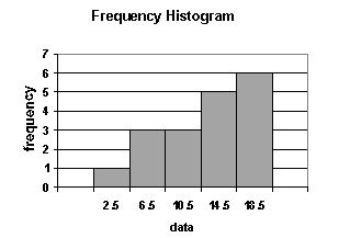
  • The class frequencies are shown on the vertical (y) axis (by the heights of bars drawn next to each other).
  • The classes (intervals) are shown on the horizontal (x) axis.
  • There is no space between the bars.

...
statusnot read reprioritisations
last reprioritisation on suggested re-reading day
started reading on finished reading on


A book on Mythology must draw from widely different sources.
statusnot read reprioritisations
last reprioritisation on suggested re-reading day
started reading on finished reading on

pdf

cannot see any pdfs